PERFECTING USERS' COOKING EXPERIENCE
PERFECTING USERS' COOKING EXPERIENCE
PERFECTING USERS'
COOKING EXPERIENCE
PERFECTING USERS'
COOKING EXPERIENCE
January 2022


Role
UX Designer
UX Designer
Tool
Figma, Adobe illustrator
Figma, Adobe
illustrator
Overview
PERFECTING USERS'
COOKING EXPERIENCE
PERFECTING USERS'
COOKING EXPERIENCE
PERFECTING USERS'
COOKING EXPERIENCE
I set out to design a feature to elevate users’ cooking experience with the Savr app to accelerate their growth by using a modified version of Google Venture’s Design Sprint method.
I set out to design a feature to elevate users’ cooking experience with the Savr app to accelerate their growth by using a modified version of Google Venture’s Design Sprint method.
Impact *based on the final usability testing results
Impact
*based on the final usability testing results
Impact *based on the final usability testing results
Users found recipes in new design are easy to follow.
Users found recipes in new design are easy to follow.
100% users found new feature enhance cooking experience
100% users found new feature enhance cooking experience
+ 100%
+ 100%
+ 100%
Recipes are easy to follow
+ 100%
+ 100%
+ 100%
Helping cooking prep
+ 100%
+ 100%
+ 100%
New feature is helpful
About Savr Recipes
About Savr Recipes
About Savr Recipes
Sarv is a new startup that shows hundreds of recipes and cooking tips for at-home chefs. They have an active community of users who rate and review recipes for other users.
Sarv is a new startup that shows hundreds of recipes and cooking tips for at-home chefs. They have an active community of users who rate and review recipes for other users.


Savr Recipes Logo
Day 1. Understand
PROBLEMS
PROBLEMS
PROBLEMS
Insufficient instructions
Insufficient instructions
Insufficient instructions
Users have difficulty with following recipes because of insufficient instructions and a lack of information on some processes and techniques.
Users have difficulty with following recipes because of insufficient instructions and a lack of information on some processes and techniques.
Users often failed to make a dish they expected, didn’t learn from the recipes.
Users often failed to make a dish they expected, didn’t learn from the recipes.
New feature needed
New feature needed
New feature needed
The native app needs new feature to excites current users and to promote to get new users.
The native app needs new feature to excites current users and to promote to get new users.
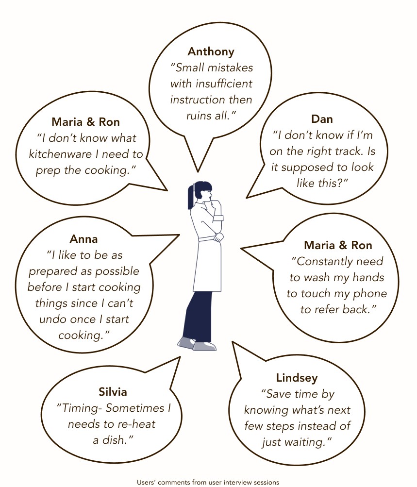


WHAT QUESTION DO I WANT TO
ANSWER IN THIS DESIGN SPRINT?
WHAT QUESTIONS
DO I WANT TO ANSWER IN THIS DESIGN SPRINT?
WHAT QUESTIONS DO I WANT TO ANSWER IN THIS DESIGN SPRINT?
WHAT QUESTIONS DO I WANT TO ANSWER IN THIS DESIGN SPRINT?
Recipes presentation
Recipes presentation
Recipes presentation
HMW let users follow and understand recipes easily so that they make meals as they excepted in terms of taste and time?
HMW let users follow and understand recipes easily so that they make meals as they excepted in terms of taste and time?
Preparation information
Preparation information
Preparation information
HMW get users essential information to prepare cooking?
HMW get users essential information to prepare cooking?
Minimizing washing hands
Minimizing washing hands
Minimizing washing hands
HMW avoid users washing hands to get back to their phone to refer to recipes constantly?
HMW avoid users washing hands to get back to their phone to refer to recipes constantly?
COOKING JOURNEY WITH SAVR RECIPES
COOKING JOURNEY
WITH SAVR RECIPES
COOKING JOURNEY
WITH SAVR RECIPES
COOKING JOURNEY
WITH SAVR RECIPES


The app has one major user map. A user of Sarv would:
Luanch the app.
Browse a recipe.
Choose a recipe.
Read the recipe.
May do grovery shopping for the chosen recipe.
Cook a meal by following the recipe.
Enjoy a delicious meal.
They might save the recipe for future use if there were happy with the result.
The app has one major user map.
A user of Sarv would:
Luanch the app.
Browse a recipe.
Choose a recipe.
Read the recipe.
May do grovery shopping for the chosen recipe.
Cook a meal by following the recipe.
Enjoy a delicious meal.
They might save the recipe for future use if there were happy with the result.
The critical aspects to a better user experience for users are:
The critical aspects to a better user experience for users are:
The critical aspects to a better user experience for users are:
At a glance
At a glance
At a glance
At a glance
Being able to know and prepare all they need to cook at a glance.
Easy instruction
Easy instruction
Easy instruction
Easy instruction
Cooking instructions should be easy to understand and follow.
Less cooking time
Less cooking time
Less cooking time
Less cooking time
Minimize the cooking time with smart order of the recipes.
Day 2. Sketch
Crazy 8s
Crazy 8s
Crazy 8s
EXPLORING
HANDS-FREE RECIPE DESIGNS
EXPLORING HANDS-FREE RECIPE DESIGNS
EXPLORING
HANDS-FREE RECIPE DESIGNS
Much like the experts at GV suggest, I started to go through several existing products to find great ideas that could inspire Savr’s experience.
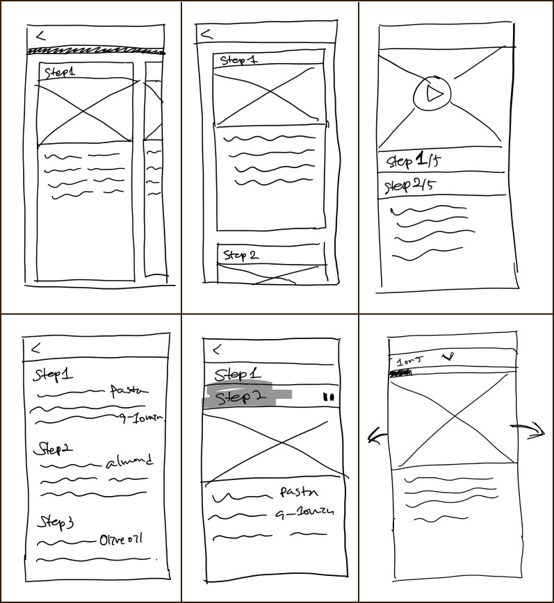


Solution sketches
Solution sketches
Solution sketches
RECIPES AT A GLANCE
RECIPES AT A GLANCE
RECIPES AT A GLANCE
I selected the best idea from the Crazy 6s by considering the user map and usability. Then, more sketches were added to make an essential flow.
I mainly focused on,,,
Delivering all information without raising users’ cognitive load.
The order of information is displayed for users to understand the dish clearly.
Minimizing cooking time and steps.


Day 3. Storyboard
COOKING PREPARATION
& INTUITIVE FLOW
COOKING PREPARATION & INTUITIVE FLOW
COOKING PREPARATION
& INTUITIVE FLOW
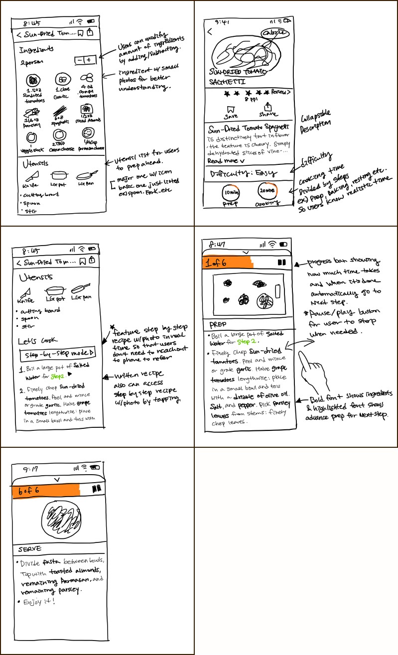
To expand Day 2’s solution sketch to complete the storyboard, I sketched other screens considering two things, essential information to prep and being intuitive.
To expand Day 2’s solution sketch to complete the storyboard, I sketched other screens considering two things, essential information to prep and being intuitive.


Day 4. Prototype
BALANCE BETWEEN TEXTS
& VISUAL AIDS
BALANCE BEWTWEEN TEXTS & VISUAL AIDS
BALANCE BETWEEN TEXTS
& VISUAL AIDS
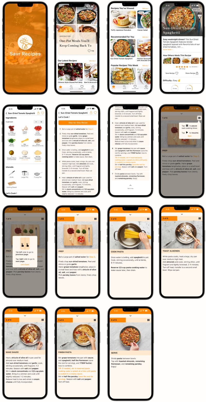
Recipes require a decent amount of text to describe what ingredients, kitchenware, and tools to prep and what to do with them. It’s much information to digest and follow during cooking.
While creating high fidelity prototypes, I focused on the following:
Following users’ cooking flow for seamless flow.
Maximum visual aids to low users’ cognitive load.
Using different fonts and colors to be scannable.


Day 5. Test
HAPPY AT-HOME CHEFS
WITH VISUAL AIDS
HAPPY AT-HOME CHEFS
WITH VISUAL AIDS
HAPPY AT-HOME CHEFS
WITH VISUAL AIDS
HAPPY AT-HOME CHEFS
WITH VISUAL AIDS
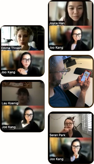
I recruited 5 participants who are at-home chefs at all levels to conduct remote usability testing.
I recruited 5 participants who are at-home chefs at all levels to conduct remote usability testing.
Cooking experience
Cooking experience
Cooking experience
2 people cook everyday.
2 people cook everyday.
2 people cook everyday.
3 people cook 3-4 times a week.
3 people cook 3-4 times a week.
3 people cook 3-4 times a week.
Their recipes from
Their recipes from
Their recipes from
Recipe books.
Recipe books.
Recipe books.
Cooking blogs.
Cooking blogs.
Cooking blogs.
Social media. (Youtube, Instagram, TikTok)
Social media. (Youtube, Instagram, TikTok)
Social media. (Youtube, Instagram, TikTok)


The usability testing's goal was to know...
The usability testing's goals
to know...
The usability testing's goal was to know...
Recipes presentation
Recipes presentation
Recipes presentation
if users can use the step-by-step cooking feature easily.
if users can use the step-by-step cooking feature easily.
Preparation information
Preparation information
Preparation information
if all essential information were implanted in the design to fulfill users’ needs to result in a successful outcome = a delicious meal.
if all essential information were implanted in the design to fulfill users’ needs to result in a successful outcome = a delicious meal.
Minimizing washing hands
Minimizing washing hands
Minimizing washing hands
if the autoplay recipe with real cooking time progress bar is helpful for users so that they don’t need to touch their phone constantly while they are cooking.
if the autoplay recipe with real cooking time progress bar is helpful for users so that they don’t need to touch their phone constantly while they are cooking.
USABILITY TESTING RESULTS
USABILITY TESTING RESULTS
USABILITY TESTING RESULTS
Recipe Page
Recipe Page
Recipe Page
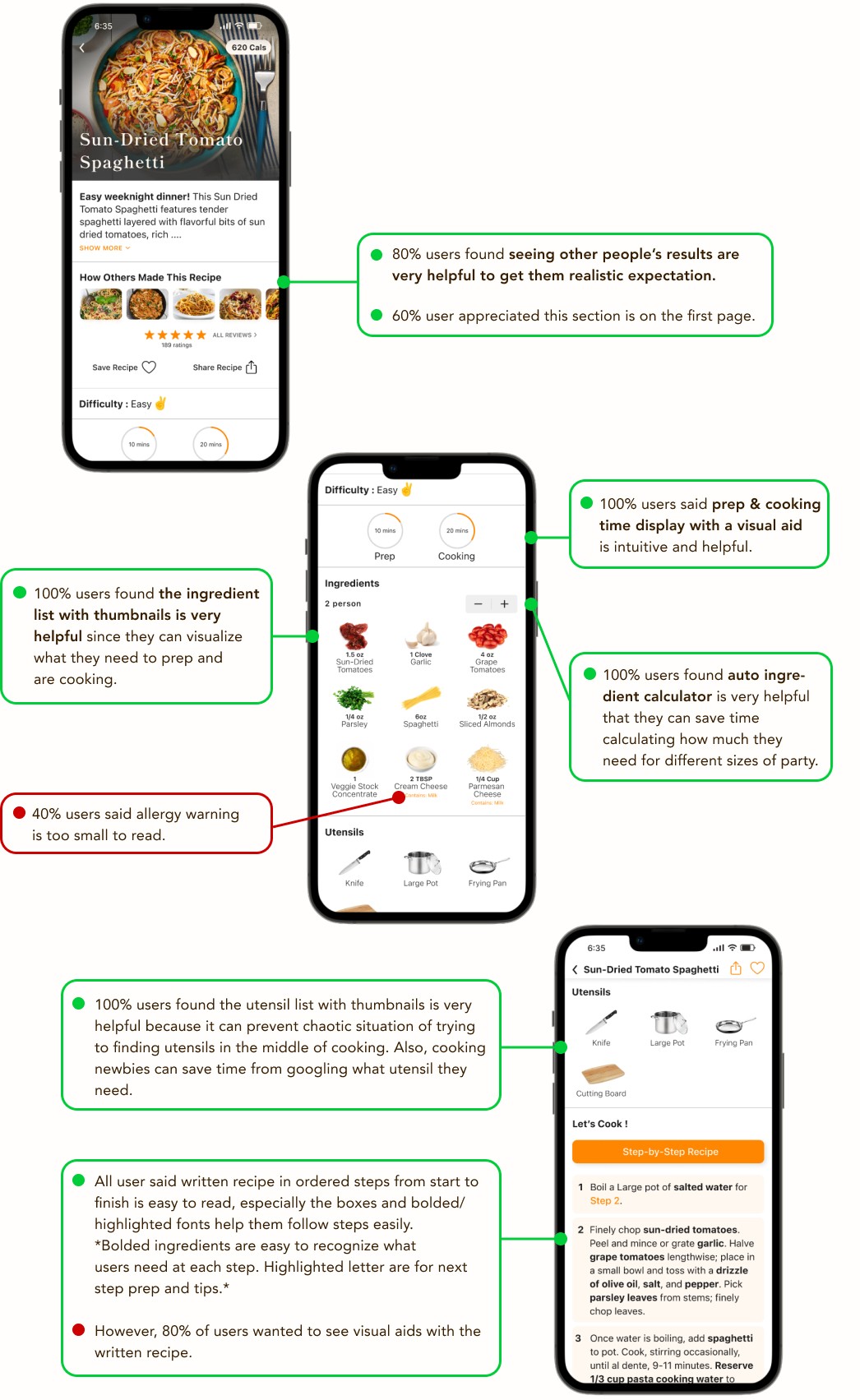
Main goal : Give essential information to users to prep cooking.
Pain Points : Insufficient Information.
Main goal: Give essential information to users to prep cooking.
Pain Points: Insufficient Information.


Step-By-Step recipe feature
Step-By-Step recipe feature
Step-By-Step recipe feature
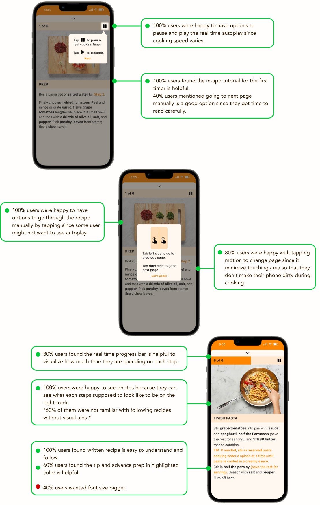
Main goal : Help users accurately and easily follow the cooking instructions.
Pain Points : Insufficient information, lack of visual aids, keep touching the phone while cooking.
Main goal : Help users accurately and easily follow the cooking instructions.
Pain Points : Insufficient information, lack of visual aids, keep touching the phone while cooking.


Reflection
DESIGN SPRINT FIRST TIMER
DESIGN SPRINT
FIRST TIMER
DESIGN SPRINT FIRST TIMER
People are highly adaptable to surroundings and situations. People tend to be more efficient and focused when resources are limited. The boxed timeline made me focus on core issues only. Then, it pushed me to generate ideas freely in limited minutes and never go back to reiterate or overthink what's already been done. Also, knowing there's no time to overthink or reiterate made me more efficient than ever in UX design elements and UI design. This Design Sprint process eliminated wasted time by overdoing it and helped me develop a neat solution and clean design. It would be helpful to mix this method with the traditional design process. I'd love to keep utilizing this method for future projects to make the process and design more efficient and innovative.
People are highly adaptable to surroundings and situations. People tend to be more efficient and focused when resources are limited. The boxed timeline made me focus on core issues only. Then, it pushed me to generate ideas freely in limited minutes and never go back to reiterate or overthink what's already been done. Also, knowing there's no time to overthink or reiterate made me more efficient than ever in UX design elements and UI design. This Design Sprint process eliminated wasted time by overdoing it and helped me develop a neat solution and clean design. It would be helpful to mix this method with the traditional design process. I'd love to keep utilizing this method for future projects to make the process and design more efficient and innovative.
